How to find the busiest DoorDash areas near you
Learn how to read DoorDash's heat map and how to plan a shift before you're on the road.

Guess wrong on this, and you burn gas driving to a dead zone. Yes, there's a live DoorDash heat map, and it lives inside the Dasher app, refreshing roughly every 10 minutes to show where restaurants are busy and where drivers are needed [1]. No, there's no public website that shows that same live demand data to people who aren't logged in as active Dashers.
If you're trying to check conditions before you sign up or before you start a shift, the in-app view isn't available to you. This article covers where the live map lives, what it shows, how to read it, and what to use when you want to plan a shift before you're already on the road.
Where is the heat map in the Dasher app?
The live map is the colored zone overlay inside the Dasher app. Open the app, tap Dash Now or Schedule a Dash, and the map loads for your market. Red hexes mark areas currently sitting on a lot of offers, black flame icons mark spots that tend to run busy at this hour, and the zone color tells you whether you can start dashing right where you are [1]. It refreshes about every 10 minutes, so what you see is a recent snapshot rather than a second-by-second feed.
Two conditions gate it. You need an approved Dasher account, and you need to be signed in. There's no browser version, no public link, and no preview for people who are still deciding whether to sign up. That's the whole answer to the question in the title: yes, it exists, and it's only visible from inside the app once you're already a driver.
What does the DoorDash heat map show?
This overlay is the colored zone display built into the Dasher app, not a standalone site you can pull up in a browser. It paints your market with color to tell you two things at once: where offers are clustering and where DoorDash wants more drivers on the road.
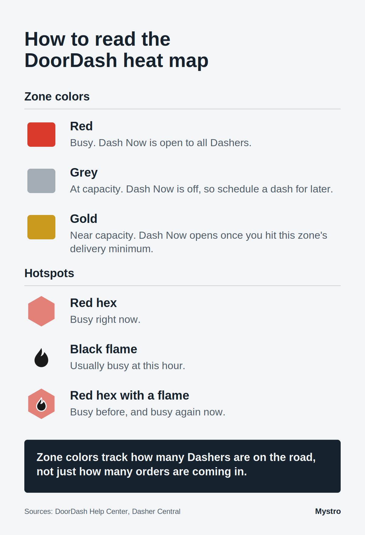
Two kinds of hotspots show up on that overlay. Dynamic hotspots appear as red hexes marking a restaurant or area currently sitting on a lot of offers. Historical hotspots show up as black flame icons without a red hex, flagging spots that tend to run busy at this time of day based on past patterns. One is happening now, the other is a memory of what usually happens.
The zone color itself controls your access to Dash Now:
Zone color | What it means | What to do |
|---|---|---|
Red | The zone is busy and Dash Now is open to all Dashers | Head toward it or start your dash |
Grey | The zone is at capacity, so Dash Now is off | Move to an active zone or schedule a slot |
Gold | The zone is near capacity, so Dash Now only opens for Dashers who've hit that zone's delivery minimum | Tap the zone to see its minimum, prioritize areas close to you |
Zone colors aren't an order count. DoorDash says they update based on how many Dashers are on the road, so a zone can go red because it's short on drivers, not because orders suddenly spiked. Read the color as "more drivers wanted here," not "a stack of orders is waiting for you."
One more useful detail: you don't have to sit inside the red hex to get offers from it. Proximity raises your odds, but the routing boundary reaches past the visible overlay, so getting close counts even if you're a block outside the shape.
Best times and areas to use the DoorDash heat map
Timing does more for your night than any single zone choice. Those red zones light up in predictable rhythms, and the drivers who earn well ride those rhythms instead of fighting them.
Time window | Hotspot signal | What to look for |
|---|---|---|
Lunch, 11am to 2pm | Builds around office and business districts | Restaurant rows near workplaces |
Dinner, 5pm to 9pm | Strongest daily peak, spreads into residential | Dense neighborhoods ordering in |
Late nights and weekends | Concentrated near nightlife and campuses | Bar districts, college areas |
The best area types are consistent: popular restaurants, downtown business districts, and food hubs tend to generate steady offers [1]. Layer the timing on top, and you position where offers cluster when they cluster.
Position slightly ahead of the rush rather than into the middle of it. Rolling up to a hotspot at 5:45 for a 6pm dinner peak puts you in place before the crowd, while arriving at 6:15 drops you into a lot where other Dashers are already parked. When everyone converges on the same red hex, the per-driver offer rate falls, because the same pool of orders now splits more ways. Sitting one block ahead of the cluster, in the direction trips usually head, can quietly outperform parking dead center where competition is thickest.
Weather and local events shift these patterns too. A rainy evening pushes order volume higher across residential neighborhoods as fewer people want to drive out. A local sports game or concert draws delivery demand toward the venue and nearby bars well into the night. That demand spike will show up on the zone overlay when it happens, but knowing your market's recurring events in advance lets you plan your positioning before the spike, not after.
Learn more in our article about the best time to drive for deliveries.
Common misconceptions about the DoorDash heat map
The overlay is genuinely useful, but a handful of assumptions about it cost drivers money. These are the ones worth unlearning:
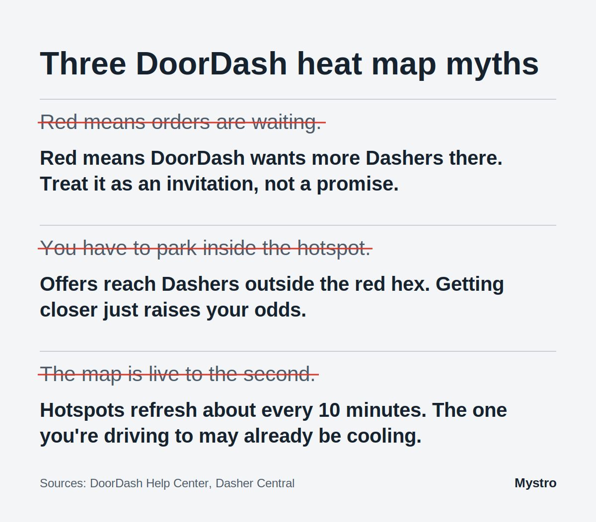
A red map means guaranteed orders. It doesn't. Red signals demand plus driver need, not a specific order sitting in a queue with your name on it. Treat it as an invitation, not a promise.
You have to sit inside the hotspot. You don't. Offers route to drivers outside the red hex too, and proximity is what raises your odds, not being planted in the exact center.
The map is always current. It refreshes about every 10 minutes, which means a hotspot glowing on your screen may already be cooling by the time you drive over. Read it as a recent snapshot, not a live-to-the-second feed.
These signals reward drivers who read them as probabilities, not guarantees.
Can you check a live DoorDash heat map without the app?
This is the question most people are actually asking, so here it is plainly: no official public live heat map exists outside the driver-only app. DoorDash doesn't publish a web page, a dashboard, or a preview that shows live zone conditions to anyone who isn't signed in as a driver.
The wall goes up earlier than most people expect. The Dasher app itself requires you to be logged in as an approved driver before the heat map loads, which means you can't preview conditions in your city while you're still deciding whether to sign up. And even inside the app, dashers report that the full heat map view while actively on a delivery is no longer available the way it once was, so your window into the map narrows once a trip starts.
This matters most in two practical situations. The first is when you're new to an area and want to know whether it's worth dashing there at all: the app can't answer that question until you've already committed to the drive. The second is when you're deciding between an early dinner shift and a late one. The in-app map shows you what's live right now, but it can't tell you which window typically produces better density in your specific market.
Third-party tools and community workarounds don't fill this gap reliably either. Screenshots of the zone overlay shared in Facebook groups or Reddit threads go stale within an hour, and there's no tool that scrapes DoorDash zone data in real time outside the official app.
That leaves a real gap for anyone who wants to plan ahead: a way to see where the busy windows usually land before you leave the house rather than after you're already parked in the wrong lot. That's the gap the Mystro DoorDash Heatmap is built to fill.
How to plan a DoorDash shift before you leave home
The Mystro DoorDash Heatmap is a free planning tool that shows restaurant offer density by hour and day of the week across U.S. metros, with no account required. The reason to run it alongside the app: the native Dasher app map shows where demand is right now, and the Mystro DoorDash Heatmap shows where it usually is at this hour on this day, so you pick your starting zone before you leave instead of chasing the map once you're already driving.
It's an interactive map with zoom controls, so you can pull back to compare neighborhoods or drop in on a specific restaurant row and read how its activity shifts from a Tuesday lunch to a Friday night. One distinction matters here: the tool draws on historical restaurant activity patterns, not a direct feed of DoorDash order data, and its dataset was last updated in April 2026. It won't tell you what's happening in your zone this exact minute. What it does well is show you where the busy windows typically fall, which is exactly what you want before you start the car.
Let’s say it's 4:30 pm on a Wednesday and you're deciding where to start a dinner shift. You open the heatmap, zoom to your side of town, and see that the restaurant row by the office park runs hot from 5:30 pm to 7:30 pm on weekdays while the strip near the stadium stays quiet until Friday. You drive to the office-park row for 5:15 pm, sign in to the Dasher app, and the live map takes over from there. You arrived ahead of the crowd instead of chasing a red hex that may already be cooling by the time yo’ve reached it.
Feature | Dasher app heat map | |
|---|---|---|
Update frequency | Roughly every 10 minutes | Historical dataset, last updated April 2026 |
Data type | Live zone demand and driver-need signal | Historical restaurant offer density patterns |
Best use case | Reacting to conditions mid-shift | Planning where to be before you leave |
Cost | Requires an active Dasher account | Free, no account needed |
Once you've used the heatmap to pick your window and your zone, the Mystro app handles the part that comes next: filtering offers and tracking what you actually earn while you dash.
Frequently asked questions about the DoorDash heat map
Is there a live DoorDash heat map I can check online?
No. There's no public website that shows live DoorDash heat map data. The live map exists only inside the driver app and is visible only to drivers logged into an active account. DoorDash has never released a public version of this data for non-drivers. For pre-shift planning outside it, the free Mystro DoorDash Heatmap shows historical restaurant activity by hour and day across U.S. metros, with no login required.
What do the colors on the DoorDash heat map mean?
Red means the zone is busy and Dash Now is open to all Dashers. Grey means the zone is at capacity and Dash Now is off. Gold means the zone is near capacity and reserved for Dashers who've hit its delivery minimum, which varies by zone [2]. Colors track how many Dashers are on the road as much as order demand, so treat red as an invitation, not a guarantee.
How often does the DoorDash heat map update?
Hotspots refresh about every 10 minutes. Zone colors update in real time as Dashers log on and off. Because of the hotspot lag, one showing on your screen can already be cooling by the time you arrive, so treat it as a recent snapshot rather than a second-by-second readout. Plan ahead with a tool like the Mystro DoorDash Heatmap, which shows historical data and doesn’t require you to log in.
What is the Mystro DoorDash Heatmap?
Yes. If you're an approved Dasher, open the app and you'll see live hotspots and zone colors before you tap Dash Now. What the app can't show you is what a zone usually looks like at a given hour. For that, the Mystro DoorDash Heatmap shows typical busy windows by day and hour, no login needed.
Can I check DoorDash hotspots before I start driving?
Yes, through the Mystro DoorDash Heatmap. The in-app map only appears once you're logged in and dashing, so the Mystro tool is the practical way to scout typical busy windows and zones before you leave the house. Pull it up, look at your target neighborhood by day and hour, and you have a baseline for where to position yourself when the shift starts.
How to check how busy DoorDash is in your area before a shift
There's no public live DoorDash heat map to bookmark, but you're not flying blind. The next step takes a couple of minutes:
Open the free Mystro DoorDash Heatmap, pick your metro, and look at your target neighborhood for the day and hour you plan to drive.
Head to that zone about 15 minutes before the busy window, sign in to the Dasher app, and let the live map handle the rest of the shift.
When you want offer filtering and earnings tracking on top of positioning, use Mystro.
References
[1] DoorDash. "DoorDash Hotspots: How to Find the Best Places to Dash." Dasher Central (DoorDash official blog), 2025-11-21. https://dasher.doordash.com/en-us/blog/doordash-hotspots
[2] DoorDash. "New Dasher: Navigating Reserved Zones." DoorDash Help Center. https://help.doordash.com/en-us/dashers/article/new-dasher-navigating-reserved-zones
This post first appeared in The Mystro Newsletter — driver tips, earnings strategies, and Mystro updates, in your inbox every week.